Worthy is a sports marketing start-up that partners with brands and individuals to create a connection between the brands and talented athletes and creators. They partner with brands who want to align their ideals with unique individual, team, and community triumphs, in addition to athletes and creators who want to promote and monetize their personal brands and communities.
Worthy strongly believes in building meaningful connections, empowering their audience, and promoting diversity and inclusion. The following designs share all the ways in which the Worthy brand was brought to life and given a visual voice through the style of their branding and various deliverables.


The primary logo for Worthy is a logotype, designed to emphasize the brands athleticism and bold personality. It is the most identifiable with the brand and is for the usage across all applications unless a specific circumstance calls for the use of a secondary logo due to the available space or goal in mind

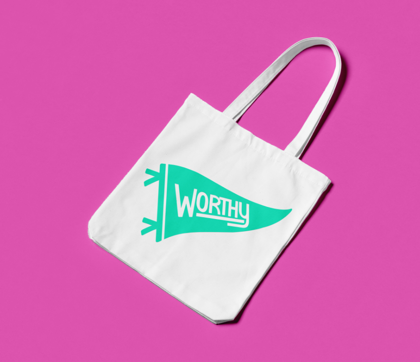
This logo combines the typographic elements of the primary logo with a flag element to more strongly portray the spirit of Worthy with an additional sense of movement and personality.

This icon logo allows for more creative freedom, and is primarily used in instances where the primary logo appears too “busy” or to apply where a smaller, simpler logo is needed.
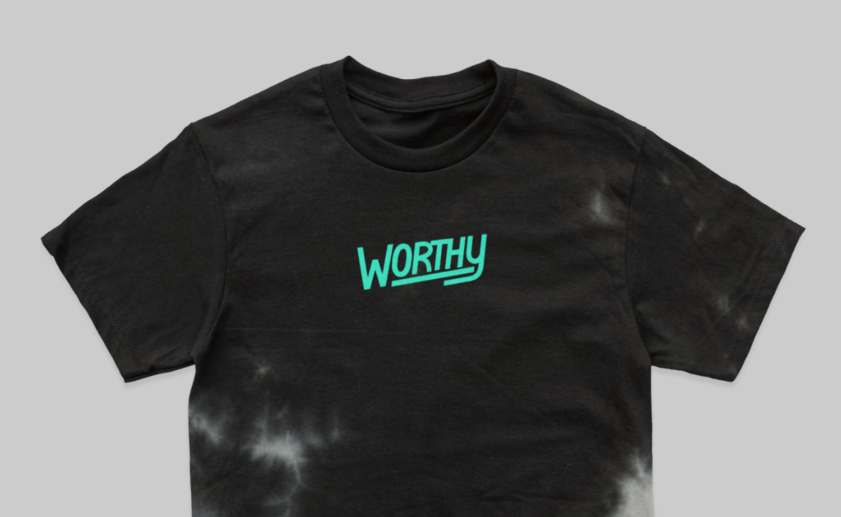







The color palette for Worthy builds from the original brand colors of mint and magenta into vibrant variations and neutrals to promote the feeling of empowerment and inclusivity.
%20copy.png)
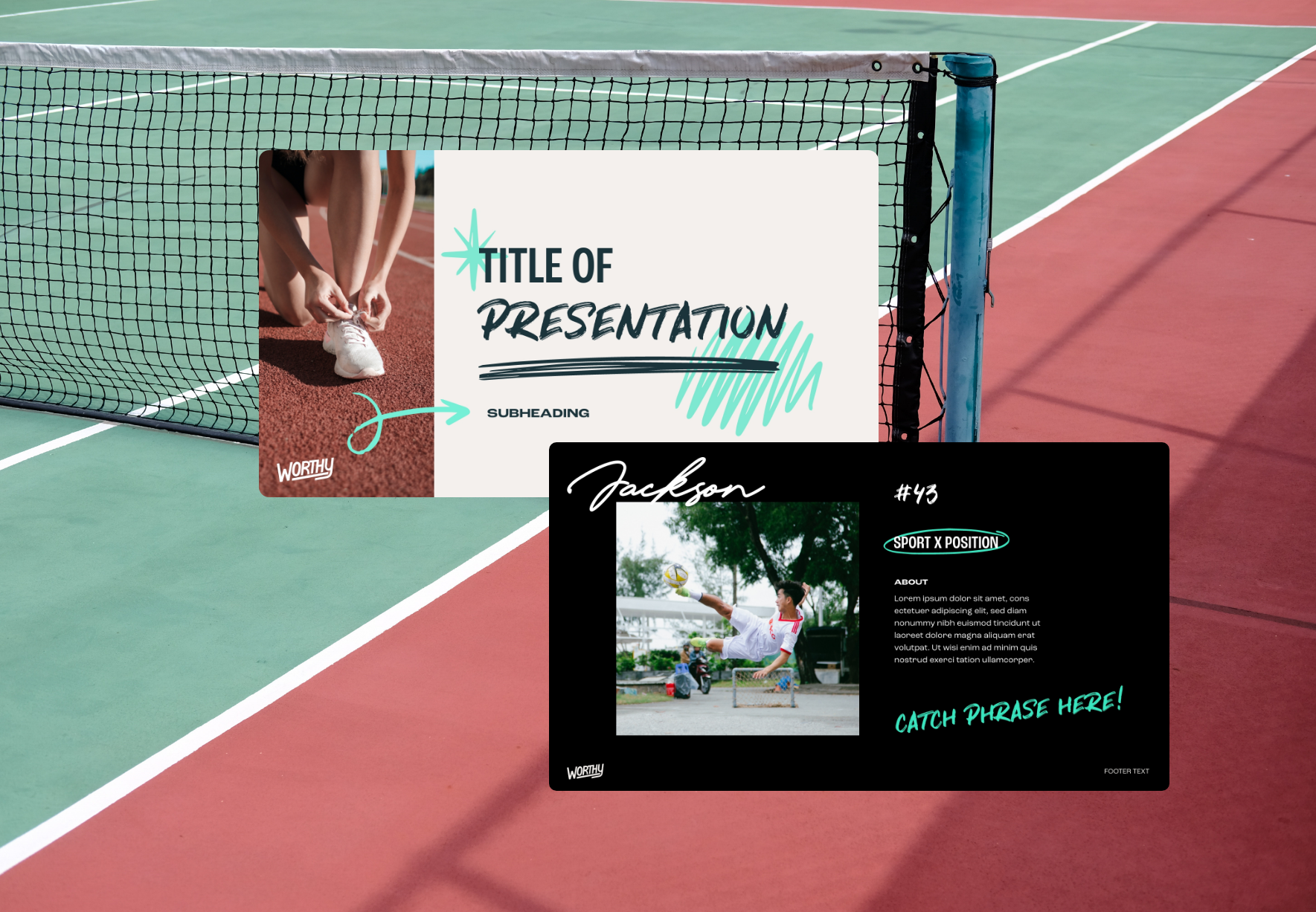
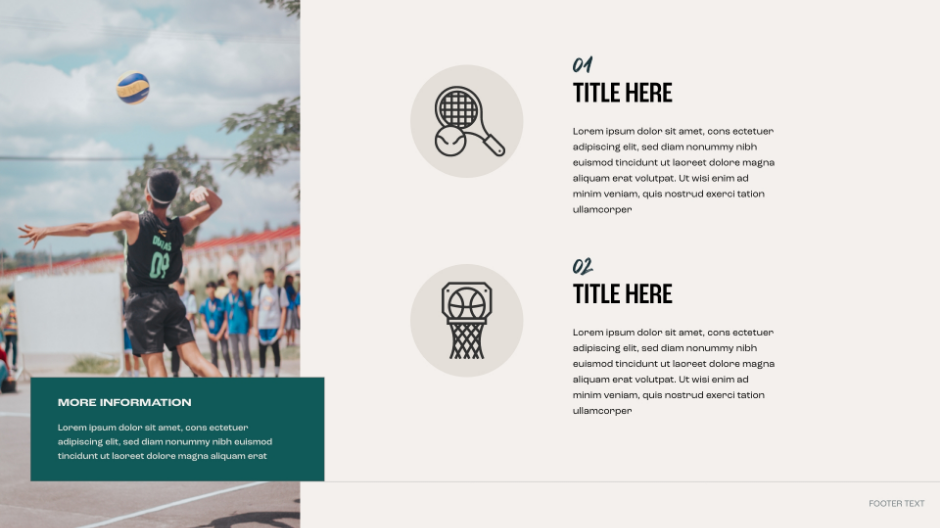
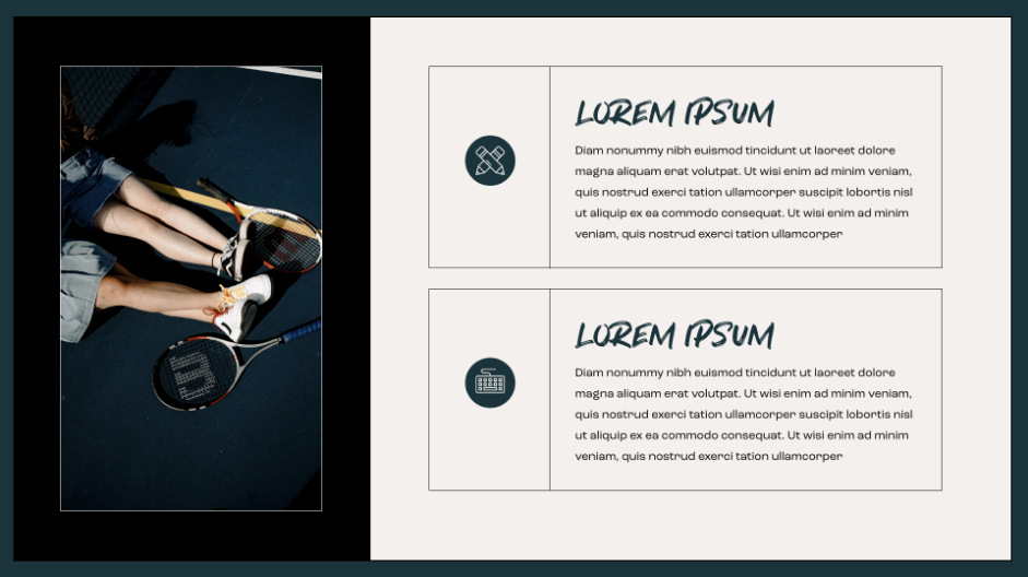
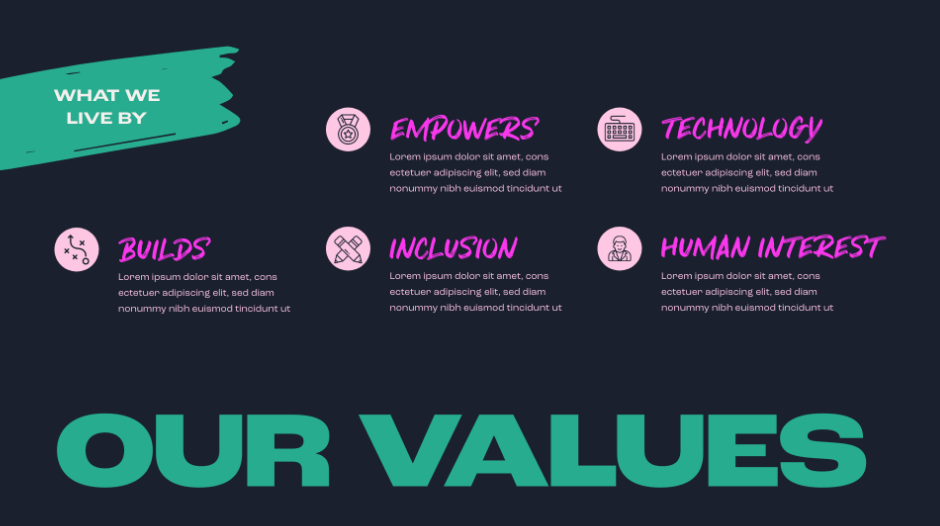
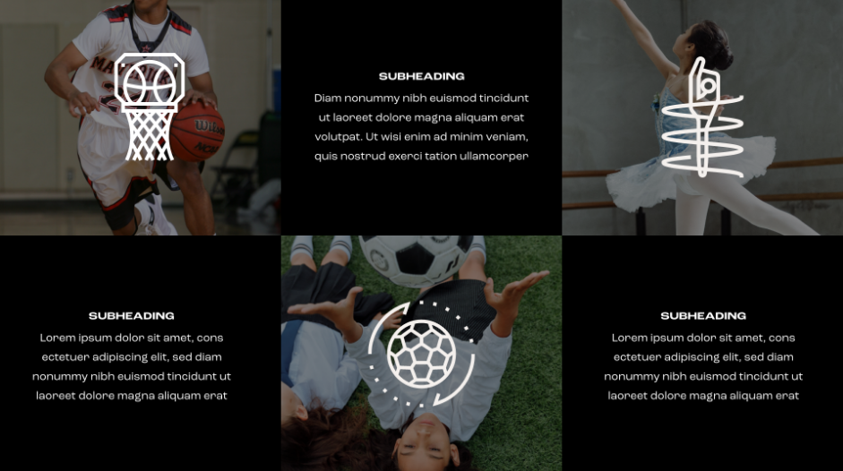
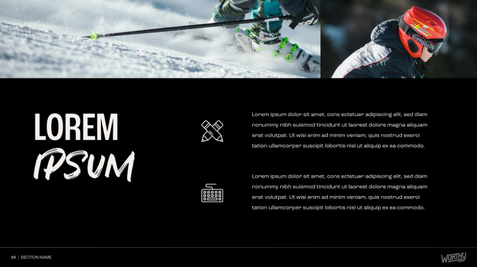
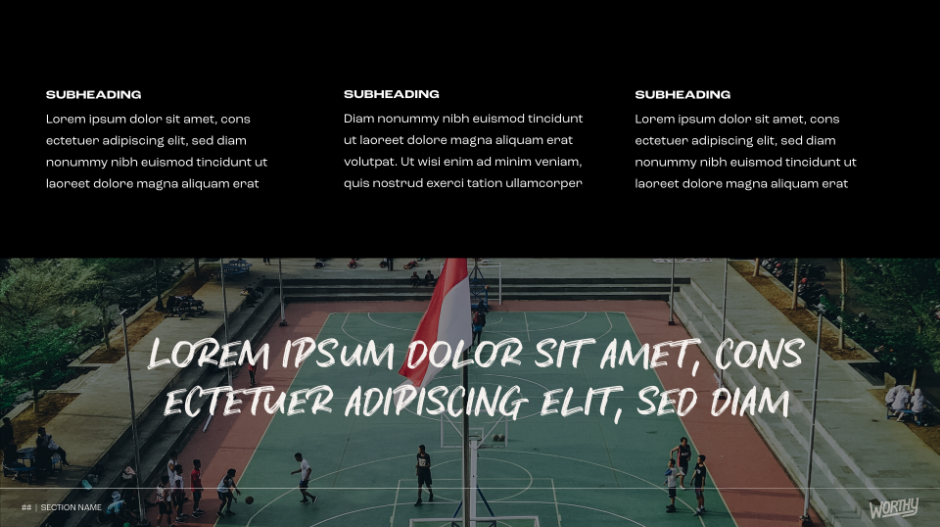
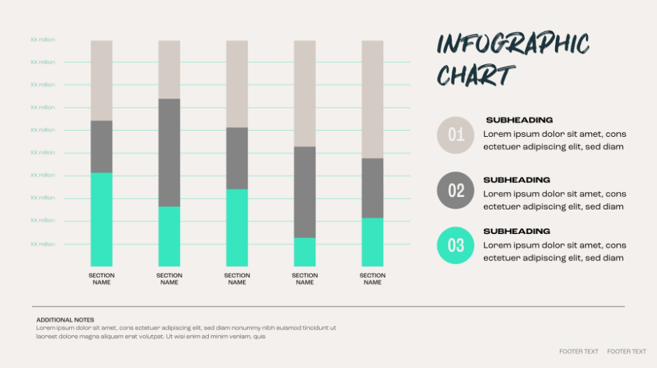
Designed in Adobe XD, then built out as a PowerPoint Template for seamless accessibility and editing for the client, this Pitch Deck is completely customized to the Worthy brand in a way that is fun, engaging, and informational. It can be used countless times and for a multitude of goals. With many different layout variations beyond the examples below, the client has the ability to present content in every way the brand requires.
